Top 4 Key Elements of Standard Website Design Service!

By | Date posted: | Last updated: December 29, 2020
Website Design

Websites have become an integral part of this digital age. They are often used to present their own content or to market a product. Many people design their own website. Unfortunately, you can often see that in the results. Most of the time, the simplest design rules are thrown overboard for your own webpage and the design begins like crazy.

Creating an appealing website is not difficult, but time-consuming. But there are a few basic rules that should be observed. Fortunately, web design differs little from “normal” design. If a few basic rules are observed, the result can be seen.

Basic rules for website design

First things first: nobody wants to see a cluttered website. The page should therefore be kept as simple as possible and too much formatting and continuous text should be avoided. Pictures, videos and symbols are well suited to loosen up the content, but these should also be used with care. The basic rule is: do not overwhelm the visitor and offer them a page that is as informative and well-structured as possible with ease of navigation.

Searching with mobile devices is becoming more and more important – this is why a website must be able to be displayed well on smaller screens such as smartphones or tablets. Accordingly, everyone who wants to offer a website today also has to deal with responsive website design.

There are some key points to keep in mind: Headings should be bold and easy to read. Sans-serif fonts are ideal for this. Subheadings give a text and structure and it is easier for a reader to find something. This also improves the ranking in the search engines.

A sans serif font is good for body text and the text should be at least 12 font size. It is important that the contrast between the background and the text is as good as possible so that it can be read easily. One and a half line spacing in the text should be standard. These points are particularly important if a rather older target group is to be addressed.

Which font is the best?

Especially if the website is to contain content, it is important to make the text as legible as possible. Fonts such as Proxima Nova are suitable here. In any case, it makes sense to stick to one font as much as possible so that the page looks harmonious.

Correct choice of colors

Just like in everyday life, colors can be positive and negative. Here, too, it is important: less, but consequently. It is better to choose three colors that harmonize well with each other and can be found constantly on the entire homepage than to trigger overstimulation in the visitors with too many colors. Important website content such as call-to-action buttons should always be highlighted with colors, whereas background elements should be kept neutral.

Depends on the images

The right images offer real added value for a website. They should be chosen carefully and wisely and pick up the visitor on an emotional level. This makes a website interesting and creates connection. However, care should be taken to ensure that the images are the right size so that they come into their own. Pixelated images look unprofessional and lead to people leaving the site immediately.

Web design is a very popular key element for your business today. If you have not taken an advantage of it yet, it is advisable to grab this opportunity for expanding your business.

If you are looking for a website design services, UX/UI web design, online store design, ecommerce website design, Please explore our website design services! We also provide website redesign services, online store redesign and ecommerce website redesign services. For more information, please explore our website redesign services!

If you have any questions or would like to know more about how Skynet Technologies can help your business to reach one step ahead, Reach out us through below form & We'll get back to you soon!

UX/UI Web Design Comparison

By | Date posted: | Last updated: April 14, 2021
ui ux Web Design

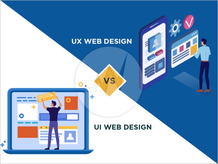
UX Web Design and UI Web Design are closely related. However, they denote different design approaches, each with a different focus.

What does UI design stand for?

UI stands for User Interface and describes the interface through which users interact with an application. UI design means that this interface is designed so practically and attractively for an app, website or other interface can be used as easily and effectively as possible.

A UI designer is responsible for ensuring that a website is intuitive to use. It should have many logical buttons and the user must immediately recognize the most important functions of the page without getting lost. This can be done via font size and font, via colors, via the arrangement of buttons or via pop-ups.

Even with a website, it is important that users are shown the best offers directly in a clear mask without a lengthy search. The same also applies to ecommerce store, information pages, comparison pages. They should all pick up the user and offer the most pleasant web experience possible.

No UI design without UX: The user experience is always in the foreground!

But UI is just a part of UX. UX stands for User Experience and is the overriding goal of creating a maximum pleasant experience for a user through design and functionality. This works less with the specific design of an individual application, i.e. whether a button is yellow or green, than with the entire structure. The subjective perception is in the foreground in UX design and less the purely functional.

UX web design aims to make the user experience as positive as possible and to positively shape a person’s emotions and experiences. Products or services are more likely to be bought or used if they are backed by a well-thought-out concept. A positive user experience is shaped, for example, by a uniform look and appearance as well as a homogeneous communication style.

This can happen through various mechanisms and always focuses on the user. UX designers are therefore always confronted with the question: How can the product, service or application be presented to the user in such a way that as many positive emotions as possible are triggered?

What defines a good UX and UI design?

Good UX design is shaped by functionality. It has fulfilled its task when people have been completely satisfied with their concerns after using an application. In other words, not only did they find what they were looking for, but they also had a pleasant experience, as the application was designed to be particularly user-friendly, appealing or entertaining.

Good UI design is also characterized by consistency. A similar look can be found in all the applications offered, which increases the recognition value. An appealing design is essential for a surface to develop its full potential. Only if the design is right can users really have a positive user experience.

In this way, UX and UI design can support each other in the best possible way

While UX design counts on the feeling of using it, UI design is increasingly aimed at the look. Both approaches are closely related, after all, a good feeling also comes from a good look. For UX designers, developing a new application is often about finding bugs that interfere with smooth operation.

Often several people are called in to test the application and report any bugs. Even with prototypes and beta testing to work makes sense. The latter can then be evaluated under the aspects of why users do not click on a certain button or which button is clicked particularly frequently, etc. Such subtleties are then optimized together with the UI designer.

A different color, font or placement of a button can ensure that user behaviour changes completely. UX and UI design are therefore difficult to separate and usually work closely together.

What skills do UX and UI designers need?

The skills of a UX designer focus on the context of use and the experiences while using an application. UX designers need to know the target audience of an application and keep this in mind when developing an application.

The UI designer must focus on making a product that is visually appealing and easy to use. The aesthetics and optics play a big role in UI design. Intuitive use should be in the foreground and supported by the design. These two areas are inextricably linked in a good web application.

If you are looking for a website design services, UX/UI web design, online store design, ecommerce website design, Please explore our website design services! We also provide website redesign services, online store redesign and ecommerce website redesign services. For more information, please explore our website redesign services!

If you have any questions or would like to know more about how Skynet Technologies can help your business to reach one step ahead, Reach out us through below form & We'll get back to you soon!

Avoid the 5 Most Common Website Design Mistakes for Better User Experience!

By | Date posted: | Last updated: June 8, 2021
Website Design

Have you ever left a website because you found it unsightly or messy? A successful website is not just about exciting content. A coherent web design presents your content in an appealing way and helps users to find their way around your website intuitively. But where do you start? There are numerous possibilities for the design of a website – some of them deliver less than convincing results. The good news: You can learn a lot from these examples.

In the following, Top 5 tips to avoid common website design mistakes

1. Confusing start page

People who are surfing online have a particularly give low attention span. It is all the more important that users quickly find what they are looking for on your website. Many website operators make the mistake of filling the start page with all the content offered. A large number of colors, logos, seals of approval and highlighting are often used in order to emphasize the individual points.

Keep the start page simple and tell your users briefly and concisely what you have to offer them. It is better to save detailed information and background stories for the individual sub-pages – they are better off there.

2. Complicated navigation

So, you now know that various sub-pages help to structure your content in a meaningful and clear manner. However, many website operators make an easy-to-avoid mistake here: they make navigation unnecessarily complicated. When building your website, keep in mind that most people are visiting your site for the first time and are new to it. Check out the ways to avoid website design mistakes for great user experience.

Only create as many subpages as you actually need. Also make sure that each subpage can be reached from the homepage with a maximum of two clicks. The best way to place your navigation menu is clearly visible in the upper quarter of the directly visible area, either in the header or in the sidebar. If you want to go a step further, let the menu bar scroll with you. So, users can jump between your subpages at any time.

3. Poor Readability

Do you have exciting content that you want to share with your users? Then make sure that they can read the content effortlessly. There are a lot of web design, especially when it comes to legibility.

Avoid the following:

  • Hard to read font
  • Insufficient contrast between background and font color
  • Small font size & small line spacing
  • Center text across the entire width, no margin
  • Missing paragraphs & subheadings
  • No Heading tags or no highlighting text

That seems better:

  • Clear, legible writing
  • Contrasts (preferably dark text on a light background)
  • Min. 16-pixel font size & approx. 1.5 line spacing
  • Left aligned text with max. 90 characters per line
  • Meaningful paragraphs & appropriate subheadings
  • Highlight important content with bold text

4. Sub-optimal images

Of course, web content is more appealing when your text is supported by images. Too often it happens that the images used on websites do not match the content or are not very meaningful. Use images that convey trust and competence, such as professional-looking photos of you and your team at work.

5. Too large formats

You have probably already heard that you should use the highest possible resolution images and videos, otherwise your website will appear blurred. This statement is not entirely correct and is a widespread web design misconception.

Why? Large image and video files slow down your website loading time. If the loading time is too long, these may jump off without even looking at your website. That would be a shame now that you know the common web design mistakes and your website looks completely professional!

Get started online with a web design and digital marketing agency!

Local online marketing that is precisely tailored to your company – that is what we at Skynet Technologies provide. Of course, you could also try to get your company into the online world on your own. But with our experienced agency at your side, you not only save time, you also benefit from the professional expertise of our employees and can continue to concentrate on your core business. In the meantime, we take targeted measures to attract new customers and increase awareness in your region.

Do you need any help to improve your user experience of website? We are here to help you out! If you are looking for UX/UI web design, online store design, ecommerce website design, Explore our website design services! We also provide website redesign service, website revamp service, online store redesign service or ecommerce website redesign service, for more information, please explore our website redesign services! Ultimately, UX helps to improve conversion rate. If you require help with search engine optimization, digital marketing, social media marketing, content marketing, explore our SEO Services!

If you have any questions or would like to know more about how Skynet Technologies can help your business to reach one step ahead, Reach out us through below form & We'll get back to you soon!

How Drupal 9 UI/UX Design Can Improve Conversion Rate & Reduce Bounce Rate of Website?

By | Date posted: | Last updated: May 6, 2021
Drupal Web Design Service

Introduction

The digital landscape is evolving constantly, and hence there is a rising demand for content management systems(CMSes) while the organizations are trying to keep pace with the customer needs. Without customized experiences, responsive websites, and easier interactive elements on your sites, users take no time to chuck you out and go to your competitors. Hence businesses are amping up their efforts to improve the users’ digital experience and to optimize the conversion funnel all around and achieve their business goals.

In this blog post, we see how Drupal 9 can reduce the bounce rates of your websites and improve your conversion rate optimization(CRO).

Current Status of Drupal CMS

With over one million users worldwide, Drupal is one of the most popular and comprehensive open-source content management systems used by small enterprises, government organizations, and complex monoliths alike. Drupal 9 is the newest version released in June 2020 and it is the culmination of efforts of numerous contributors across the globe who came together to create an innovative platform that’s designed for everyone to use. Check out the guide on why choose Drupal CMS Development over other CMS for your business website.

If we take a closer look at Drupal 9 updates, we find that it’s all about innovation and not features. It doesn’t offer any new features but provides a leaner, more secure system with APIs that are easier to work with. It also entails a new front-end theme that enhances Drupal web design services and also collates community-driven improvements taken from the Drupal Product Survey 2020.

Drupal 9 and the new front-end theme

Drupal 9, the new avatar of Drupal is definitely the future-ready CMS with innovative and intuitive solutions with cutting-edge features and easy upgrades to empower users.
With no major new features, Drupal 9 is reinforcing Drupal 8’s priority to overhaul its user experience and be much friendlier for agencies, content creators, marketers, and not just website developers. In a way, gone are the days when Drupal was all about development-first and design treated as second fiddle. Now it’s all about usability and accessibility thereby, providing great digital experiences to the users.

Drupal 8 was having Bartik as its default theme, which hasn’t got an update since 2011. The need for a new default theme in Drupal has been on cards for quite some time now.

The new design Olivero is simple, flexible, and expected to address the limitations of the current theme Bartik and to support Drupal’s web design services.

How does the new front-end theme Olivero better?

Drupal’s backend has been growing all the while and it is one of the robust systems, however, the front-end theme Bartik has many out-dated features. The new default theme will create the best first impression of Drupal web design and reflects the modern backend that Drupal sports under the hood.

The new theme Olivero is

  • Simple – Clutter-free. All the colors, effects, and visual elements that are heavy and irrelevant would be a thing of the past now.
  • Modern – Support for modern browser features and interaction modes
  • Flexible – Multiple options for the front-end developers to choose from
  • Focused – No heavy distractions for the user like higher contrasts, negative spaces, and any other elements that mar the users’ attention
  • Accessibility – WCAG AA compliant and hence all the elements would be accessible to everyone.

Drupal 9 Olivero UI/UX Design Components

Drupal 9 UI/UX components would improve the user experience because all visually appealing websites have one thing in common – a modern, flexible, and accessible theme.

1.Color Palette

Websites would look more beautiful with the new theme color scheme.

  • The base color is set to bright blue.
  • Neutral gray to counter-balance the layout and other design elements
  • A combination of darker and lighter colors to enhance the accessibility and highlight the design elements in the layout.

2. Typography

The base font size in the body is 18px and adapted to smaller viewports as well. Consistent line-height and spacing have been maintained when setting the scale for typography.

3. Header & Navigation

The header section reflects how flexible the new theme is. It incorporates seamlessly, all logotypes and titles. It also comes in multiple versions to choose from and turns into a hamburger menu once the user scrolls down.

4. Sidebar Region

A single and beautiful sidebar aligns to the right of the website’s main content area and the content team displays related posts and other utility blocks.

5. RTL(Right-To-Left) text direction support

Drupal 8 already has multilingual support and this gets even better with the new frontend theme in Drupal 9 UI/UX Design services.

The new theme also supports the latest functionality like embedded media, layout builder, and more. The web design system parts like color palette, typography, and animation are so minimal making Drupal 9 the most beautiful CMS ever!

How does Drupal 9 web design drive conversions?

User experience is one of the many yardsticks to measure your website’s CRO. When a customer visits your website, its the theme that defines what your site looks like. The layout, styles, typography, buttons, color palette, and a lot more decide how easy it is for the user to navigate across your website. They build your brand’s identity by improving the visual appeal of your website. Many experts believe that beautiful themes indeed make beautiful websites.

With the new theme, Drupal web designs provide unparalleled design experience creating professional, innovative, and highly customized solutions. Drupal web designs are more in line with the modern content management systems and are also responsive catering to various devices. The theme can also contribute to the smooth user’s interaction and improves the usability of your website. This eventually translates into better conversions and reduces the bounce rates of your websites.

Other Features

Here are some of the other capabilities that are added to Drupal 9 that could improve conversions. The following updates reduce the clutter, improve the speed, performance, security, and scalability of the websites reducing the bounce create, improving the conversions, and increase your business revenue.

1. Backward Compatible

The last upgrade from Drupal 7 to Drupal 8 is still haunting many as it consumed time and created fatigue. Hence the Drupal community learned from their past mistakes the hard way and made the new update buttery smooth. Drupal 9 is compatible with its predecessor, Drupal 8 and hence you will be able to use data, modules, and configurations created on Drupal 8. This won’t impact the performance of the system in any way and hence Drupal web designs will remain clutter-free and faster to load.

2. New Versions of Symfony and Twig

Drupal 9 uses Symfony 4.4. Twig 1 also got upgraded to Twig 2. The new upgrades can only translate into higher performance, improved developer experience, and enhanced security.

3. Drops the Deprecated Code

Drupal 9 won’t support any deprecated code in Drupal 8. Drupal 9 sanitizes the code and removes any out-of-date code from the Drupal 8 website to ensure a smooth upgrading experience.

4. Cut-down Third-party Dependencies

With all the deprecated code removed by Drupal 9, its load of dependencies will get significantly lighter. This ensures longer security support for your website.

Wrap-up

The “nothing new in Drupal 9” opinion isn’t entirely accurate. There may not be any new paradigms of development but it is recommended for enterprises to upgrade to Drupal 9 sooner or later to create engaging digital experiences and deliver tangible business results. Also, there are no painfully disruptive changes if you choose to upgrade to Drupal 9. Drupal designs created by Skynet Technologies are scalable, secure, and most notably,power-packed and built for high-performance, far beyond the designs created by other Drupal web design companies.

If you are looking for a Drupal Web Development, Drupal Commerce Development and Other Related Web Development Services, for more information, Please Explore our Drupal Web Development Services! We also provide Drupal Website Maintenance Services, Drupal Migration and Drupal Application Security Audit. For More Information, Please Visit Our Drupal Maintenance Services!
If you have any questions or would like to know more about how Skynet Technologies can help your business to reach one step ahead, Reach out us through below form & We'll get back to you soon!