Top 10 Steps to do Website Redesign without affecting SEO!

By | Date posted: | Last updated: May 7, 2021
Website Redesign SEO

SEO is not a flash in the pan, but a continuous process of optimization, which is always geared to the current conditions of the Google algorithm. Website operators who are planning a redesign of their website should be aware of this.
Because of numerous changes in the HTML code and the individual pages, errors tend to creep in, which have a detrimental effect on the search engine optimization of the website. Conversely, the right measures during website redesign can strengthen the SEO-relevant factors of a page. Check out the top 5 reasons why every small business needs a Website Redesign SEO services.

Step-by-step guide for SEO-friendly website redesign:

1. Download the URL structure

First you should create a backup of your current page structure. Finally, the numerous changes will also affect the URL structure of the website. And so that nothing goes wrong, a backup copy is strongly recommended.

Tip: Use plugins to get the URL structure.

2. Perform website redesign on temporary URL

Very important: Never implement the redesign directly on your website. Otherwise you risk various problems for the performance and usability of the website. It is smarter to duplicate the page and store it on a temporary URL. Or you can change the domain as soon as the changes take effect.

3. Test your website after redesign

Now is the turn of a detailed review of your website. That affects everything: the content, the links, various functions, CSS, images and so on. By the way, tools also help here.

4. 301 redirects

Permanent redirects via 301 redirect is of crucial importance. Because in this way all SEO advantages are retained for the new URLs. In addition, users and Google are consequently redirected to the new URL, which in turn benefits the user experience.

5. Relocation to the new website

Once the new design and all relevant redirects are in place, you can move.

6. Use the Google Webmaster Tool

Then check the new website again. The best way to do this is to use the free Google Webmaster Tool, which will show you any errors.

7. Check crawling

The Google Search Console should be familiar to every website operator. As always with changes to the website, you have to initiate a new crawl of the website. Under the sub-items “Retrieval as by Google” and “Retrieve and render”, you can initiate the appropriate measures. If your website has not yet been indexed, click “Submit to Index”.

8. Check the robot.txt file

To be on the safe side, you can check the robot.txt again for damage or sources of error. The option of the same name under the “Crawling” function will help you with this.

9. Send a new sitemap to Google

A redesign is often accompanied by a changed page structure. It is therefore very important that you submit your new XML sitemap to Google. The corresponding function can also be found in the Google Search Console.

10. Continuous monitoring after redesign a website

The redesign of your website is now completed in an SEO-friendly manner, but you are far from finished. Because now it is important to regularly monitor the performance, visibility and user experience of the website in order to identify new optimization potential.

The ranking of your page for relevant keywords is one of the most important metrics. There are some SEO tools that can be used to automatically check SERP. As soon as there are major changes in the ranking or the traffic stalls, this data helps to understand the cause of the problem and to find possible solutions.

If you are looking for a website redesign service, website revamp service, online store redesign service or ecommerce website redesign service, Explore our website redesign services! We also provide ecommerce website design, online store design, shopping cart design, website design services, UX/UI web design, Please explore our website design services!

If you have any questions or would like to know more about how Skynet Technologies can help your business to reach one step ahead, Reach out us through below form & We'll get back to you soon!

Google’s Core Web Vitals – Top 3 Metrics to Measure User Experience!

By | Date posted: | Last updated: April 14, 2021
Google Web Vitals

Google launched the Web Vitals as a uniform evaluation basis for websites in May. Now Google explains how these are measured.

Google used a number of different tools and metrics in the past to analyse websites. In order to finally create a uniform standard, Google introduced the Web Vitals in May. These three factors indicate website stability, loading time, and interactivity.

Google accesses real user data (e.g. from the Chrome user experience Report) and laboratory data that is collected during rendering to collect the Web Vitals. A Google User Agent is always used. If a website uses dynamic rendering, the creation of static HTML can cause slight delays. Caching and warming up can prevent the cache beforehand. Google points out that the performance of users and Google Bot could be different.

Therefore, website operators shouldn’t rely solely on Google bot data. It’s also not enough to rely on tools like PageSpeed Insights or Lighthouse. These work with laboratory data that provide hypothetical performance data for a perfect environment. They therefore don’t represent the actual user experience, but provide starting points for more in-depth analyses.

Google recommends site operators to use the report on the Web Vitals in the Google Search Console. Even, if the user data for each URL is also not available.

Core web vitals: Google’s key figures for evaluating the user experience explained

Google wants to establish a uniform evaluation basis for the user experience of website under the name Web Vitals. We explain to you how the three Web Vitals key figures are made up.

From the Chrome Dev Tools to Lighthouse and PageSpeed Insights to the speed report in the Search Console; over the years, Google has developed a number of options for measuring the performance of a website. Basically, this is not surprising; after all, it is an important key figure in terms of user experience. In a blog post, however, Google admits that the large number of different tools and metrics causes problems of its own. In turn, Google wants to solve this in the future with a standardized rating system called Web Vitals.

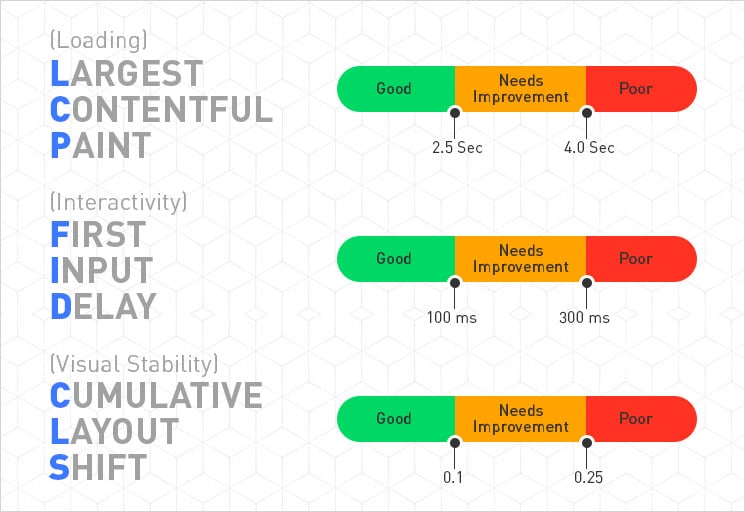
Core web vitals essentially consists of 3 key figures

web core vitals

Largest Contentful Paint (LCP):

LCP measures the rendering time of the largest element that is within the visible area of ​​the page. Google defines everything less than 2.5 seconds as a good value. Render times between 2.5 and 4 seconds are classified as in need of improvement according to Google’s Web Vital definition and everything above is considered to be poor value according to the company.

First Input Delay (FID):

FID measures the time that elapses between the first user activity and the response of the browser. What is meant, for example, is the delay that exists between the first click on a button or link and the action taken. Google regards all FID values ​​below 100 milliseconds as good. Values ​​between 100 and 300 milliseconds are considered to be in need of improvement and anything above that as bad.

Cumulative Layout Shift (CLS):

CLS serves as a metric for the visual stability of a website and measures how often page elements shift unexpectedly. This means, for example, asynchronously loaded page elements that suddenly change the layout of a text. But buttons, which suddenly appear completely different after being clicked, are also included, according to Google. CLS is calculated from two values ​​that are multiplied together. Google considers the first impact fraction, by which the company refers to the percentage of the viewport that the change affects.

If an element takes up half of the page before the change and then moves down 25 per cent, it affects 75 per cent of the page and the fraction of the impact is 0.75. This value is multiplied by fraction of the distance. This is known as the greater distance that moves an element. In the previous example, the value would be 0.25. The CLS would then be 0.1875.That could already be improved, because Google only considers values up to 0.1 to be good. All values from 0.25 are classified as bad.

Core web vitals: This is how you can test your web presence!

The Web Vitals key figures LCP, FID and CLS are currently being recorded by the Chrome User Experience Report. In the long term, however, they should also appear in PageSpeed Insights and the Search Console’s speed report. Currently, both tools only measure the FID. In addition, Google is working on a Chrome extension that will show you the web vital results of a visited website directly in the browser.

Google wants website operators to record Web Vitals key figures themselves using real visitor data as far as possible. For this purpose, Google has published an open source Web Vitals JavaScript library on GitHub. The code can, for example, be integrated into your own page in conjunction with the respective analytics provider, or it can also serve as a reference for your own recording solution for Web Vitals key figures.

If you have query regard to different tools and metrics to evaluate your websites, we are happy to assist you. If you are looking to improve your website’s usability, speed, user experience, explore our UI UX web designs services! We are also providing website revamp, website redesign, online store revamp, ecommerce website revamp services, for more information, please explore our website redesign services!

If you have any questions or would like to know more about how Skynet Technologies can help your business to reach one step ahead, Reach out us through below form & We'll get back to you soon!

Quality UX Web Design to Make your Website Visitors Happy!

By | Date posted: | Last updated: May 28, 2021
ux web design

The main aim of any “Quality UX Web Design” is to make their visitors happy & let them give a reason to coming back to brands and companies. What’s behind it, and how properly UX designers implement it?

The term user experience (UX) describes all aspects of a user’s experience when interacting with a product, service, environment, or facility. UX designers want to inspire people. Already clear. You want to design the interaction between technology and users in such a way that good experiences arise. Correct. But do you want to make people happy with your designs? The response is a resounding yes and no. Because anyone who is brooding over an information architecture just to lead the user to the buy now button as quickly as possible has not yet thought the matter through to the end. Can that be the point of UX? Rather not. This is supported by developments over the past hundred years: Although new technologies have greatly simplified people’s lives in many ways.

From usability to positive psychology

The question about the actual goal of UX designers is therefore justified. Most technologies still lack an explicit focus on increasing the wellbeing of the people who use them. In practice, many users equate experience with usability. In this sense, UX design should above all make the use of a product simple and understandable.

However, in order to make the user experience a moment of happiness, good usability is not enough. This is why UX has set itself apart from usability more and more in recent years. In this interpretation, the UX designers deal not only with usability, but also with the emotions of the users during the interaction. As a result, the user-centred design has increasingly changed to the approach of experience design. Positive emotions ensure that users are not only satisfied with the product, they also have fun and bond emotionally.

The Positive UX web design approach now goes one step further. It no longer just leads users to their goal as quickly as possible or generates short-term emotions. At the very beginning of the design process, quality UX design asks which fundamental positive experiences the use of a product should generate and how the product can promote the user. Only on this basis does the user experience develop. What may sound idealistic at first, is a thoroughly innovative design approach that can create added value for users and companies.

The basis for quality UX design is “positive psychology”: It deals with the question of what makes people happy and is based on the knowledge that happiness does not necessarily come from the fact that there is no unhappiness.

Two theories or models are particularly interesting for quality UX design. One comes from one of the masterminds of positive psychology, is called the Perma-Model. Accordingly, real well-being arises when several components are fulfilled in life: Positive emotions (P), commitment (E), relationships (R for “Relationships”), meaning (M for “Meaning”) and successes (A for “Achievements”).

The second – for UX design interesting – the approach of positive psychology. According to the study, the experience of flow promotes happiness in people. A person is in the flow to use and demonstrate skills and knowledge when faced with an appropriate challenge. In the flow, the person forgets the time, concentrates only on the current activity, and fades out everything around them.

Quality UX web design in practice

In practice, two types of quality design can be distinguished: On the one hand, explicit quality design refers to technologies whose main task is to promote human well-being. This includes mindfulness apps, for example. On the other hand, so-called active quality design integrates well-being as a conscious goal in the design process of everyday technologies that actually have a different primary function. This is exactly where quality UX design comes about, which companies need for sustainable success. Various quality design approaches are available for this. Above all, the methods can be integrated into the user research phase and the generation of ideas.

One method for quality UX design is experience interviews. In contrast to conventional user interviews, they do not focus on problems and challenges in using a product; instead, designers ask about positive experiences in a context in experience interviews. The users should therefore describe what makes them happy in certain situations and why. An example: In order to improve a project management tool as user experience, there were experience interviews that asked potential users about experiences in the context of work in general – i.e. independent of the tool. The result was the positive experience “Creating something together”. The provider of the project management tool finally implemented this knowledge in a function with which teams can jointly set their goals in writing and show their progress graphically. That helped the employees to structure clearly defined tasks in the team and created a pleasant working atmosphere through a transparent workflow. Without the experience interviews, the provider would probably not have come up with the idea of supporting the community experience in design. In addition, UX designers should also consider general human needs in their design.

The quality thing about it: The connection is scientifically sound, and designers can easily incorporate these needs into their designs. For example, in order to take into account autonomy – that is, the possibility of aligning one’s actions with one’s own goals and values – in the UX design, a “do not disturb” function on the smartphone or PC may be sufficient. In this way, users can decide for themselves when they want to receive messages, and when they do not want to be disturbed.

In order to integrate the topic of “competence” into UX design, users must be able to master challenges. For example, UX functions can provide feedback when users have completed certain steps: so-called progress steps or confirmation cards emphasize success and thus create a feeling of competence. We all know a UX function that fulfils the need for connectedness – or belonging: It’s the Like button. Through it, users express mutual appreciation and show their attachment to certain topics, opinions or products.

In addition to these three needs, science has identified many other needs that are important to human wellbeing. This includes significance, stimulation, security as well as popularity. For designers, it is worth taking a closer look at the needs of website visitors.

A framework for quality UX web design

Another approach for UX designers is the good design framework. It is supposed to help designers to enable flow states for their users. The framework contains three components: First, the users should experience positive emotions. Second, they should achieve their personal goals. And third, they should be able to act according to their values. If a product design supports all three experiences, the user blossoms during use and experiences flow.

Quality UX design does not require a new way of thinking, but a rethinking of UX design – the design goal is expanded to include the aspect of long-term well-being. Quality UX design methods can be integrated into the previous design process and thus initiate real, positive changes in the users’ lives.

With the right and quality UX design, for example, the running app can permanently motivate users to exercise so that they experience emotions not only during but also before and after the actual activity. The good experience is carried over from the interaction context into personal life and, in the best case, creates well-being and happiness. And: Happy users definitely have added value for companies. Be it through an emotional connection to the respective provider, an increased number of users, or stronger brand loyalty.

Conclusion

The point of UX design isn’t just about solving problems. Rather, it can be the starting point for promoting people’s potentials and abilities. This rethinking in UX design towards more positivity and the goal of long-term can offer real added value for users and companies. And it can shape a digital world that, with a new understanding of user-centered design, not only makes people more productive but also give their business a boost.

Do you need any help to improve your user experience of the website? We are here to help you out! If you are looking for UX/UI web design, online store design, ecommerce website design, Explore our website design services! We also provide website revamp service, online store redesign service, or ecommerce website redesign service, for more information, please explore our website redesign services!

If you have any questions or would like to know more about how Skynet Technologies can help your business to reach one step ahead, Reach out us through below form & We'll get back to you soon!

The Complete Guide on Google Accelerated Mobile Pages (AMP)!

By | Date posted: | Last updated: May 31, 2021
Accelerated Mobile Pages

AMP (Accelerated Mobile Pages) is an initiative by Google to further improve the usability of mobile devices. AMP is a specific markup in the HTML5 source code that focuses on very fast loading times for websites on mobile devices. Due to 3G or 4G network connections, content on mobile devices is generally slower to load than on the desktop. AMP pages are designed for mobile use only and therefore do not work on desktop devices.

The goal of Google Accelerated Mobile Pages project is to make mobile pages load faster. If the mobile pages load faster, more articles can be read at the same time and the bounce rate decreases due to slower loading times.

Currently, AMP is only supported by Google. The fast loading times are not related to Bing, Yahoo or other search engines.

Why was AMP developed?

The AMP project is urgently needed as mobile use is overtaking desktop search in many countries. In order to ensure the user friendliness and the loading times of the pages as desktop versions, a new solution was needed to improve the page speed.

The development of apps was the first reaction to offer a good user experience on mobile devices. Many publishers, advertisers and online retailers have developed their own mobile apps in order to offer their users a good user experience.

This approach is very successful because, on average, people spend much more time in apps than they do on mobile websites. But the apps have fewer monthly visitors than a mobile website. AMP was developed to provide a better user experience for those who visit mobile websites.

How does AMP make mobile websites faster?

Fast loading time can be achieved in two ways:

  • Produce content that loads quickly
  • Fast provision of the pages

AMP not only makes page loading faster by preferring to load items in the viewport (everything that can be seen within the screen without scrolling). Each AMP page is pre-rendered on a Google server, which means that the respective website is in the Google cache.

The users do not interact directly with their server but load the AMP website from the Google servers. This may seem like an additional barrier, but since the website is already loaded on a Google server, the website is already available in the browser before the search query has been made. This saves milliseconds.

3 Benefits of using Google Accelerated Mobile Pages (AMP)

1. The faster loading time of a website

The most important advantage of AMP is of course the fast loading time of the page. This offers users a good user experience. More importantly, AMP can help rank better in search results pages. Because the page loads faster and the page load time is one of the most important criteria for good SEO, AMP pages are more visible.

Google’s mobile-first algorithm favours sites that are optimized for mobile devices anyway.

2. The website can be checked in advance

Another benefit of AMP’s pre-rendering on Google’s server is that Google already had the time to pre-examine a page. AMP pages require a strict HTML5 structure. If a markup is missing, the entire AMP website will not work. Checking the pages ahead of time saves a few milliseconds again.

3. Pay close attention to AMP sites

A side effect of using AMP is the AMP logo that Google automatically displays in search engine results. The Blitz logo may not be familiar to many, but it is attracting attention, and so many more visitors.

3 disadvantages of using Google Accelerated Mobile Pages (AMP)

AMP also has some drawbacks to be aware of.

1. Google has the upper hand

Since this is a Google initiative, Google still has a lot of access to the pages. The best example of this is the fact that the AMP pages are loaded onto Google servers and are therefore very search engine dependent. So, your traffic here depends on Google.

2. JavaScript elements do not work

Another disadvantage of AMP is that interactive JavaScript elements do not work in AMP. Website tracking, which is essential to making good data-driven decisions, is becoming increasingly complex. While it is entirely possible to run most analytics tracks, there are some technical steps to keep in mind. Plug-and-play is also not possible.

3. Time and resources

Moving to an AMP optimized website takes time and of course, the right people or CMS systems are needed to work with it. Translating an entire website into AMP will take some time and effort to get everything set up optimally.

How can AMP be used?

Most standard CMS systems such as Magento or WordPress have plugins to make optimization on AMP pages relatively easy. If there is no CMS system with AMP plugins in place, the page can also be updated by manually changing the source code of each page.

Since AMP is an HTML5 language, you can make your pages AMP safe by adding additional markup.

In summary, AMP is a promising project that is spreading more and more. By converting your pages to AMP, you are definitely gaining a competitive advantage. Still, it is desirable that AMP sites become more popular and plug-and-play.

Furthermore, Google AMP are enhancing digital marketing strategies, increase rankings and provide better mobile-friendly experience! If you wanted to stay competitive in the mobile market, you should be AMP optimized. If you are looking to convert your website or online store in AMP or in a mobile-friendly experience, explore our website design services!

If you have any questions or would like to know more about how Skynet Technologies can help your business to reach one step ahead, Reach out us through below form & We'll get back to you soon!